Frame Filter Component
Overview
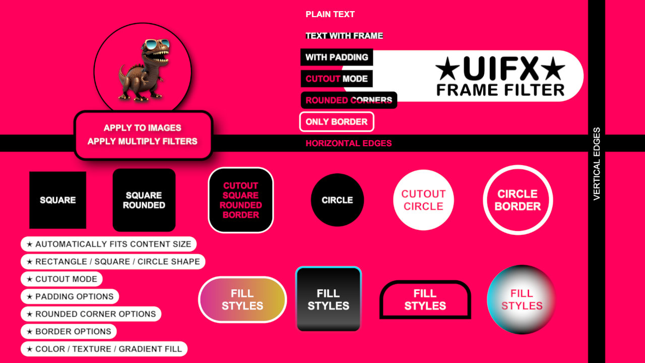
This component enables easily adding a framed outline to UI components. It supports automatic resizing to fit the content, padding, different shapes, anti-aliased rendering, rounded corners and different fill modes.
WebGL Demo
Properties
| Property | Type | Range | Default | Description |
|---|---|---|---|---|
| Shape | ||||
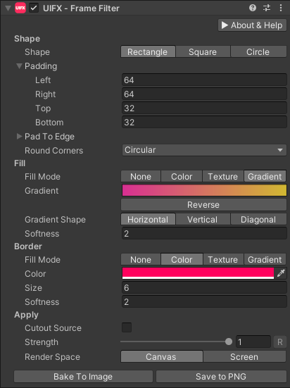
| Shape | Enum | Rectangle | The base shape to render around the source content. Options are: • Rectangle: Has the most flexibility.• Square: Ensures the frame has equal width and height.• Circle: Ensures the frame has constant radius. | |
| Padding | Float | [-inf..inf] | 16.0 | For each Rectangle edge expands the edge length in pixels. For Square and Circle shapes this is a single value that controls radius padding. |
| Pad To Edge | Bool | False | For each Rectangle edge allows padding value to be ignored and instead extends the length to the screen edge. | |
| Round Corners | Enum | Percent | The type of rounded corners to use for the Rectangle or Square shapes. Options are:• None: No rounded corners.• Small: 12.5% rounded corners.• Medium: 25% rounded corners.• Large: 50% rounded corners.• Circular: 100% rounded corners• Percent: Value between 0..1 relative to the size of shape.• Custom Percent: Specify each of the 4 corner sizes in 0..1 range.• Pixels: A single value in pixel units.• Custom Pixels: Specifyt each of the 4 corner sizes in pixels. | |
| Fill | ||||
| Fill Mode | Enum | Color | The mode to use to fill the frame background with. Options are: • None: The frame background has no fill.• Color: A single color.• Texture: A texture is used to fill the background.• Gradient: A gradient used to fill the background. | |
| Color | Color | Black | The color to fill the frame with in Color fill mode. | |
| Texture | Texture | The texture to fill the frame with in Texture fill mode. | ||
| Gradient | Gradient | The gradient to fill the frame with in Gradient fill mode. | ||
| Gradient Shape | Enum | Horizontal | The shape of the gradient in Gradient fill mode. Options are:• Horizontal: Colors run from left to right.• Vertical: Colors run from top to bottom.• Diagonal: Colors run from top-left to bottom-right.• Radial: Colors start in the center and expand in a circle shape. | |
| Radius | Float | [-inf..inf] | 1.0 | The radius of the gradient in Radial mode. |
| Softness | Float | [1..inf] | 2.0 | Softness of the frame. 1 = no softness. |
| Border | ||||
| Fill Mode | Enum | Color | The mode to use to fill the frame broder with. Options are: • None: No border.• Color: A single color.• Texture: A texture is used to fill the background.• Gradient: A gradient used to fill the background. | |
| Color | Color | White | The color to fill the frame border with in Color fill mode. | |
| Texture | Texture | The texture to fill the frame border with in Texture fill mode. | ||
| Gradient | Gradient | The gradient to fill the frame border with in Gradient fill mode. | ||
| Gradient Shape | Enum | Horizontal | The shape of the gradient in Gradient fill mode. Options are:• Horizontal: Colors run from left to right.• Vertical: Colors run from top to bottom.• Diagonal: Colors run from top-left to bottom-right.• Radial: Colors start in the center and expand in a circle shape. | |
| Radius | Float | [-inf..inf] | 1.0 | The radius of the gradient in Radial mode. |
| Size | Float | [0..inf] | 4.0 | The size of the border in pixels. |
| Softness | Float | [1..inf] | 2.0 | Softness of the border. 1 = no softness. |
| Apply | ||||
| Cutout Source | Bool | False | Whether to render the source graphic on top of the frame, or to use the source graphic to make a hole in the frame. | |
| Strength | Float | [0..1] | 1.0 | Strength of the effect. |
| Render Space | Enum | Canvas | Which coordinate system use when rendering this filter. Options are: • Canvas: Render the filter before any transforms (scale/rotation/translation etc) are applied.• Screen: Render the filter after transforms have been applied. Read more about this property here. | |
| Source Area | Enum | Geometry | Changing this to RectTransform will make the bounds of the frame conform to the RectTransform area. | |
| Expand | Enum | Expand | Whether to expand the Graphic area to accomodate this filter overflowing the original bounds. Setting this to None can be useful whhen applying effects to content you want to enclose in a frame using something like the FrameFilter component. |
Usage
Add this component to any GameObject that contains a UI Graphic component (eg Text, Image, RawImage, etc). The object will now render with a shadow.
Usage with TextMeshPro
To use this filter effect with TextMeshPro use the Filter Stack (TextMeshPro) component.
Render Space
The RenderSpace property effectively controls whether the Graphic filter is applied before or after the Transform is applied. There are two options:
Canvas- This is the default mode for all filters. In this mode the filter is rendered to theGraphicbefore it is transformed into screen-space by the localTransformand by theCanvas. This means that any changes or animations to the transform (or it's parents) will not cause the filter to re-render (unlessCanvashas per-pixel mode enabled), which is a performance benefit! This also means that when theGraphicis rotated, the filter will not be aware of this, so the filter will rotate as well. Imagine as drop-shadow effect.Screen- This was the default mode before version 1.8.0 was released. In this mode the filter is rendered to theGraphicafter it is transformed into screne-space. This means that any changes or animations to the transform (or it's parents) will cause the filter to re-render which can become expensive. It has the advantage that it is possible to do some screen-aware options, such as clamping the filter to the edges of the screen, or extending an edge to the edge of the screen (for example in the Frame Filter component)
A summary of the differences:
| Feature | Canvas | Screen |
|---|---|---|
| Adjusting transform causes filter re-render | No (unless Canvas has per-pixel mode enabled) | Yes |