Fill Color Filter Component
Overview
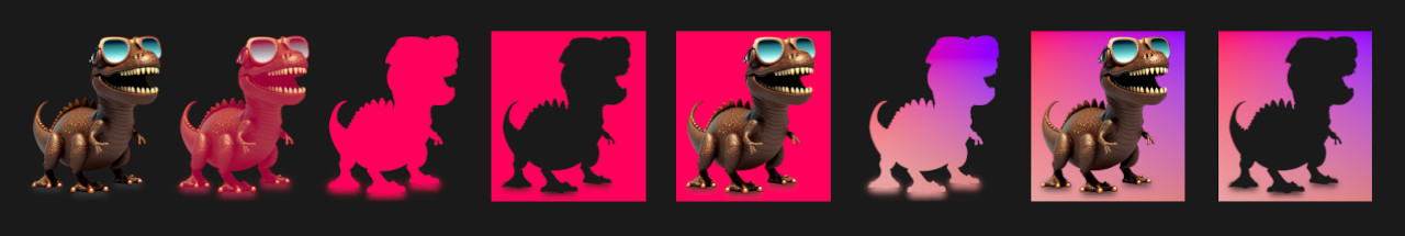
This component can fill a UI element with a solid color or a simple gradient of colors.
WebGL Demo
Properties
| Property | Type | Range | Default | Description |
|---|---|---|---|---|
| Fill | ||||
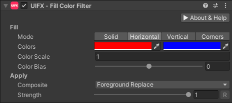
| Mode | Enum | Solid | The fill mode to use. Options are: • Solid: A single solid color.• Horizontal: A gradient from ColorA on the left edge to ColorB on the right edge.• Vertical: A gradient from ColorA on the top edge to ColorB on the bottom edge.• Corners: Four colors at each of the corners of the rectangle, creating a gradient fill effect. | |
| Color | Color | Red | The color of the fill in Solid mode. | |
| ColorA | Color | Red | The color of the left edge in Horizontal mode, and the top edge in Vertical mode. | |
| ColorB | Color | Blue | The color of the right edge in Horizontal mode, and the bottom edge in Vertical mode. | |
| ColorTL | Color | Red | The color of top-left corner in Corners mode. | |
| ColorTR | Color | Green | The color of top-right corner in Corners mode. | |
| ColorBL | Color | Blue | The color of bottom-left corner in Corners mode. | |
| ColorBR | Color | Magenta | The color of bottom-right corner in Corners mode. | |
| Color Scale | Float | 1.0 | Used to scale the positions of the edge/corner colors in Horizonal/Vertical/Corners mode. Higher values move the colors towards the center of the rectangle. | |
| Color Bias | Float | [-1..1] | 0.0 | Used to bias the position of the edge colors in Horizonal/Vertical mode. |
| Apply | ||||
| Composite | Enum | Foreground Replace | How to composite the fill with the source graphic. Options are: • Foreground Replace: Fill color replaces the foreground color.• Foreground Multiply: Fill color is multiplied by the foreground color.• Background Replace: Fills the background.• Cutout: Fills the background and removes the foreground. | |
| Strength | Float | [0..1] | 1.0 | Strength of the effect. |
| Render Space | Enum | Canvas | Which coordinate system use when rendering this filter. Options are: • Canvas: Render the filter before any transforms (scale/rotation/translation etc) are applied.• Screen: Render the filter after transforms have been applied. Read more about this property here. |
Usage
Add this component to any GameObject that contains a UI Graphic component (eg Text, Image, RawImage, etc). The object will now render with a shadow.
Usage with TextMeshPro
To use this filter effect with TextMeshPro use the Filter Stack (TextMeshPro) component.
Render Space
The RenderSpace property effectively controls whether the Graphic filter is applied before or after the Transform is applied. There are two options:
Canvas- This is the default mode for all filters. In this mode the filter is rendered to theGraphicbefore it is transformed into screen-space by the localTransformand by theCanvas. This means that any changes or animations to the transform (or it's parents) will not cause the filter to re-render (unlessCanvashas per-pixel mode enabled), which is a performance benefit! This also means that when theGraphicis rotated, the filter will not be aware of this, so the filter will rotate as well. Imagine as drop-shadow effect.Screen- This was the default mode before version 1.8.0 was released. In this mode the filter is rendered to theGraphicafter it is transformed into screne-space. This means that any changes or animations to the transform (or it's parents) will cause the filter to re-render which can become expensive. It has the advantage that it is possible to do some screen-aware options, such as clamping the filter to the edges of the screen, or extending an edge to the edge of the screen (for example in the Frame Filter component)
A summary of the differences:
| Feature | Canvas | Screen |
|---|---|---|
| Adjusting transform causes filter re-render | No (unless Canvas has per-pixel mode enabled) | Yes |